Please please please don´t touch Chibi unless you are just going to trace over it.

Otherwise I don´t care, but I love that expression, and the little feets and toes. But, on the otherhand, it it is done badly, I could get a chibi escalade instead...

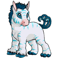
I agree with the shading, it looks horribly angular. It has a neat effect, actually, but not suitable for a default pet style. The mane is a little too detailed, and I´d like to see the tail things thinner. Goldenchaos´s redline looks much better, much more stable and with the more heavyset style I associate with the hikei.
There is something off with the head too. It seems to be turning it´s head away from us, but still looking toward us, which is odd. The head is profile while the body is 3/4 view. And the eye bugs me too, I don´t like the outline and don´t understand why it needs it.