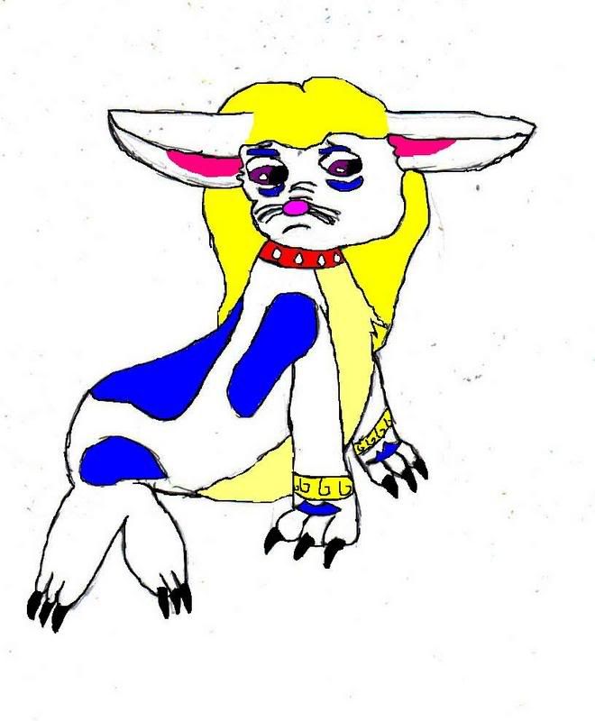
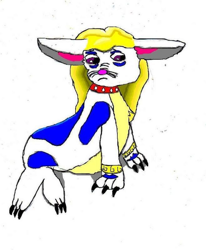
/shading advice needed. Edit: now with Background

Post finished and unfinished work here for critique and appraisal.
gomababe
Posts: 417
Joined: 27 Apr 2006 09:21 am
Gender: Female
Location: Narnia
Contact:

/shading advice needed. Edit: now with Background

Post by gomababe »

Ok so this isn't neopets or subeta related but yous rock so much when it comes to decent art that I thought I'd ask for some advice regarding shading for this here picture

Image


It's a 4th year anniversary present for an online pen-pal of mine and I'd live it to be the best it can be. Any tips would be appreciated. It was done in pencil, inked over then scanned into MSPaint where it was coloured.
Last edited by gomababe on 23 Mar 2007 07:40 pm, edited 1 time in total.
Image
Veo
Posts: 267
Joined: 26 Feb 2007 01:30 am
Gender: Female
Location: The Void

Post by Veo »

First, you need a light source. Where would you want one at?
gomababe
Posts: 417
Joined: 27 Apr 2006 09:21 am
Gender: Female
Location: Narnia
Contact:

Post by gomababe »

Oh sorry, the light source is more or less directly above her ^_^;;. It'll be dappled since the background is going to be foresty.
Image
adi_gallia
Posts: 1402
Joined: 24 Aug 2006 01:01 pm
Gender: Male

Post by adi_gallia »

Is that meant to be Gatomon? That's what I thought of upon seeing this.

I'm not really one to talk about shading, I'm sure there are going to be some much more helpful people, I just posted to ask about Gatomon. :oops:
Veo
Posts: 267
Joined: 26 Feb 2007 01:30 am
Gender: Female
Location: The Void

Post by Veo »

It looks oddly like Gatomon, but it's not at the same time . . . is it something original, Gomababe? Also, what is it's expression/mood?
checkers
Posts: 689
Joined: 29 Oct 2006 09:34 pm
Gender: Male
Location: United Kingdom
Contact:

Post by checkers »

The front claws look like a gatamon, the rest doesn't, the legs look a little odd but it's nice still =3
I like it.
uhm, shading, I highlighted where shading should be if the light source is dierectly about in bright green. you'd need to like use the image you have and use DARKER forms of the color the green is around eg the hair:
dark yellow
You could also make the hair have more detail like shade it with several shades of yellow and add waves or bumps and curves to make the hair look as if it has texture and look real like the picture of Moye (look at the previous thread) it asks for pic advice and there is loads of shading tips and examples there.
heres the shading image:
Image
viewtopic.php?t=5796&postdays=0&postorder=asc&start=0
Read through that thread, I gave a few tips there and then on page two the result was amazing.
adi_gallia
Posts: 1402
Joined: 24 Aug 2006 01:01 pm
Gender: Male

Post by adi_gallia »

Oh, after some Gatomon research I realised that this picture is quite different. I think it's the white cat like creature that did it.

Also the ring on her tail resembles those bracelets on this art.
Image
checkers
Posts: 689
Joined: 29 Oct 2006 09:34 pm
Gender: Male
Location: United Kingdom
Contact:

Post by checkers »

adi_gallia wrote:Oh, after some Gatomon research I realised that this picture is quite different. I think it's the white cat like creature that did it.

Also the ring on her tail resembles those bracelets on this art.
Image
Ew creepy dudes.
Image
I think you mean that. The tail ring is like the ones around the paws of your drawing that's what i got confused about.
It doesn't look much like a Gatomon.
gomababe
Posts: 417
Joined: 27 Apr 2006 09:21 am
Gender: Female
Location: Narnia
Contact:

Post by gomababe »

It's an Original Digimon. She's called Aquamon and yeah her expressions and ears are based off Gatomon. She's meant to be a seal {well sealion-esque}and I realised her flippers look a little odd, I'll probably go and fix that while I'm working on the shading. Thanks vey much checkers, I'm still kind trying to figure out my art style so all advice is appreciated :wink:.

edited to add:

Image

I tried to do some simple highlighting as well, I think it loks quite good but obviously I think it'll still need some improvement :).
Image
checkers
Posts: 689
Joined: 29 Oct 2006 09:34 pm
Gender: Male
Location: United Kingdom
Contact:

Post by checkers »

That looks loads better, keep it up just do more texture and different shades on the hair maybe have a certain pattern the hairs in? like not one wave going left and the other going right.
gomababe
Posts: 417
Joined: 27 Apr 2006 09:21 am
Gender: Female
Location: Narnia
Contact:

Post by gomababe »

Image

I'm still not sure about the top of the head but I'm quite happpy with the rest of it now ^_^. Took me ages to find those shades.
Image
checkers
Posts: 689
Joined: 29 Oct 2006 09:34 pm
Gender: Male
Location: United Kingdom
Contact:

Post by checkers »

Good job, maybe add some texture to the stomache if its fur...or is it like smooth?
gomababe
Posts: 417
Joined: 27 Apr 2006 09:21 am
Gender: Female
Location: Narnia
Contact:

Post by gomababe »

The stomach fur's usally smoothed down since aqua's in the water so much in the stories she's in, plus depsite the little flicks near her chest the fur there is very short.
Image
Gazella Dama
Posts: 75
Joined: 21 Jun 2006 03:08 am
Location: Behind You
Contact:

Post by Gazella Dama »

Okay, well I can see you already got some help with this, but figured I'd throw in my two cents anyway, since I only just now got back to my tablet and am able to make any attempt at a redline/diagram.

1.) Red is where darker values would go. Sorry if it's a bit confusing! As for the shadows under the body, you seem to have those down, with checkers's help. Nice job.

2.) Her face was kind of bothering me. I'm not sure what she's supposed to look like so I can't pass too much judgement, but it seemed a liiittle bit squished and off-center to me. Have you tried building up from circles and shapes first? I tried doodling a little one off to the side just to get a feel for what you might be going for. But I could be totally wrong, so :) Carry on.

3.) Just as a helpful hint, included some color swatches. Checkers in correct in that you should shade with darker colors, but you don't have to go straight down the line in value. It gives the picture more life to mix in some of the neighboring shades as you go darker (i.e. some orangey darks with the yellow gives it a warmer hue, some blues would give the white a "cool" look, and a little red and purple in the darks of the blue make them not so...monotonous).

4.) Editted out the speckle "noise" in the white area, as it was driving me nuts.

Hope this helps!

Image
Veo
Posts: 267
Joined: 26 Feb 2007 01:30 am
Gender: Female
Location: The Void

Post by Veo »

As always, Gazella Dama, you rock. ^_^
Post Reply

Who is online

Users browsing this forum: No registered users and 13 guests