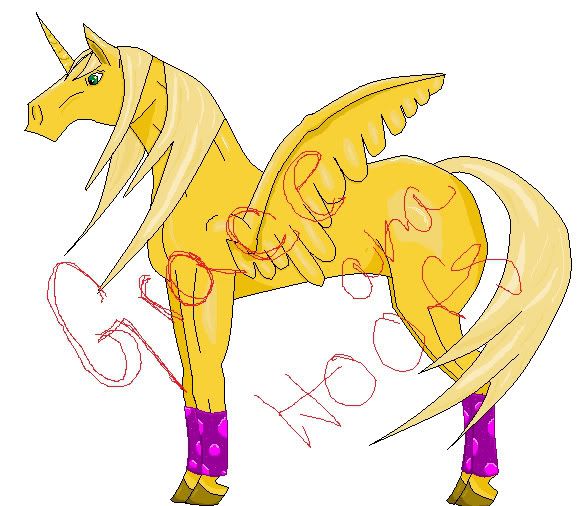
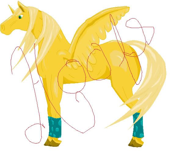
This is of my recently adopted unis Welk. The line art, coloring and shading were done in MS paint the mane blurriness and the blending of the shading was done in PS. The shding bothers me I'd like Crits and Comments please... ^_^
I made some changes according to ya'lls comments. About the mouth none of the horses I draw have mouths unless they are the realistic ones in my sketch book. I'm no good at wings but I tried.
EEP! I just realized I only have one wing.....
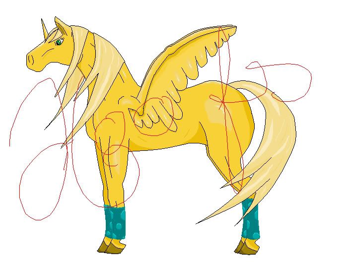
Ok, here is the lastest revised edition. I tried silver polos and they just looked washed out against the goldness. So I opted for teal, I kind of wanted to make it a richer color. I have moved the wing up to the shoulder and added the second one. I have also eleminated the 'wash board' stomach. The mane has been fixed too. Oh and I made the horn smaller and rounded out the features some.
Any more comments or crits?
Last edited by Hoofs on 15 Feb 2006 03:30 am, edited 5 times in total.
The shading is good-but real horses manes have volume-and so does hair-it's not flat to the head. Give it volume.
As well, I find that you're lacking a mouth on the Uni ^^
The wings are not that right either-try to study feathers and bird wing structures-it's very helpful
I like it-reminds me of a palamino in the way of skin colours (and I like palamino horses) You've also got the anatomy mostly correct too-though if someone can correct me-I'm crap at horse anatony ^^
Its a good picture, and the new wing(s) look Spiffeh. Could I just suggest though, and excuse me editing your picture (and so badly) but maybe you should try giving the mane volume. Like this-
Basically instead of just curving the line up you raise it above the line of the body. Bah, i'm no good at explaining things.
The wings are the main issue, for me. They are too small for an animal that large to ever fly with, but mostly, they're attatched in the wrong place. They seem to grow from the upper 'arm' rather than the shoulder blade or back area.
It's nice, I like it - bit of a supermodel's washboard stomach, but that's ok.
I agree about the volume of the hair, and I think the edited wing looks much better, but I don't think the lack of a mouth is a problem.
I just noticed the position of the horn on the forehead - I evisage uni horns being a little further back, but that's just a personal thing. The neck could maybe be a little thinner under the jaw too, I dunno.
Overall though, I like it - don't get me wrong. It's a really nice pic.
The wings are the main issue, for me. They are too small for an animal that large to ever fly with, but mostly, they're attatched in the wrong place. They seem to grow from the upper 'arm' rather than the shoulder blade or back area.
I see what you mean, however, her wings were not meant to fly. They are for balance. ^_^
Its a good picture, and the new wing(s) look Spiffeh. Could I just suggest though, and excuse me editing your picture (and so badly) but maybe you should try giving the mane volume. Like this-
I shall fix this when I have time, Thanks!
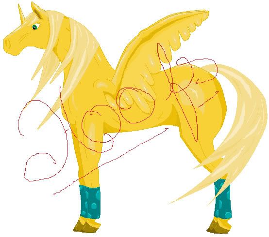
I absolutely *adore* this picture. But something about the purple legwarmer thingies... ugh. I honestly think you should just take them off.
NO! My POLOS, they must stay they must! Sorry all my unis will have polos there is no avoiding that. Another color maybe?
I wanted to post this on the bottom of the thread becasue, I really want final comments and well my thread has seems to have fallen into a black hole.
I finalized every things, and colored the lines. Any final comments or crits?
I also wanted to know how I should attempt to make this trasparent, becasue photoshop takes to many pixels when I try to delete the white space. I've already tryed to expand/contract the pixels. *sigh*
The only thing about it that bothers me is the horn, or maybe it's the angle of the horn. It seems to me it would look better if its angle matched the angle of the ears more. More like the horn you have on the very first picture.
Because as it is, the mane is flowing forward, the ears are pricked forward -- and the horn is kinda pointing straight up.
Maybe if you moved it up a bit so it was more between the eyes and then tilted it so that its angle matched the ears more?
Or, yanno, not. =D
Either way, it's a lovely picture. You should be proud of yourself.
Wow, I scrolled up and down the thread repeatedly to see the first picture and the last. You have made a big difference in the picture and I think its astounding. I really don't see any problems with it, but I shouldn't even give out critique, my horse on another thread is still in the making and its not coming out too well. xD
But I really like how you toned the emphasis down on the dark lines. The shading on the horn is my favorite. I don't know why, but it looks like it comes together really nicely. =D
Mmk... I fixed the horn, It makes a big difference. Thanks...
Shado wrote:Wow, I scrolled up and down the thread repeatedly to see the first picture and the last. You have made a big difference in the picture and I think its astounding. I really don't see any problems with it, but I shouldn't even give out critique, my horse on another thread is still in the making and its not coming out too well. xD
But I really like how you toned the emphasis down on the dark lines. The shading on the horn is my favorite. I don't know why, but it looks like it comes together really nicely. =D
Darn, teach me your horse anatomy skills!
Hehe thanks... The anatomy comes from working with lots of real horses...


