Things I like:
The new color scheme is great. (I won't lie, I loved the stupid green mohawk, but this is very cool, in both senses of the word.) I can see the secretary bird influence, and it's delightful. The head and neck are really nice: the volume of the ruff and the sense of movement around the shoulder is great, the short neck fits better with the rest of the pet, the new crest works well, the beak is
lovely, and the flash of color at the nares is inspired. Marah's right in that it's triangles rather than curves now, but I find it reads better that way. I don't mind the change in expression.
Things I don't like:
The shape of the tail is off. It's not in line with the rest of the body, and it's not symmetrical. (Goldenchaos's revamp is a little better here.) The feathers are all different shapes, and they really shouldn't be. What's more, it's been drawn flat, as a single layer. Birds of prey have very fan-shaped tails; when they perch, the fan is shut, and all the feathers (which are very broad, more so than they are here) lie on top of one another. Looking at the shut tail from the underside, we should be able
to see the whole of the two feathers at the outside edges, with the rest behind them. (We'd also be able to see a little of the light filtering through the layers, rather than the opaque tail here—and gosh, wouldn't that be pretty?)
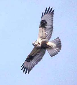
As many people have said, the wings are a little small and a little low; as has gone mostly unmentioned, the feathering isn't right. This is based on, and evidently meant to be, a rather large bird, but the placement of the feathers and the way they've been drawn is more similar to much smaller birds, which makes the entire pet look unbalanced.
Pictures of birds of prey in flight are a great help here. First, the coverts—the layers of feathers at the leading edge of the wing, done in the darker blue here—are much too long. In pictures, it's clear they're longer closer to the body and shorter nearer the wingtip, and don't go much past the wrist—the major joint of the wing, the one the beak is touched to here—at all. In the revamp, their edge is pointed rather than rounded, and they cover too much of the wing for a large bird. I would remove the second and third tiers of dark blue feathers on the wing to our left, and shorten those on the wing on the right correspondingly. Second, the secondaries—the flight feathers (in the lighter blue) behind the wrist, closer to the body—are too fluffy and downy, and a little too short; they don't look like flight feathers at all. In real birds they're nearly as broad as the feathers closer to the wingtip. In a closed or half-closed wing, like we see them here, they'd simply be layered over one another, again a little like a shut fan. Last, both the shape of the primaries—the flight feathers near the wingtip—and the shape of the wing as a whole are too pointed. In birds of prey, the primary feathers are slotted, creating the 'splayed fingers' look at the ends of the wings you can see in raptors and corvids; they're still rounded, but thinner near the tips (the feathers near the left side
here show it well). In addition, the larger raptors have rounded wingtips: the first feather isn't the longest, as it is here. That pointed wing shape is characteristic of smaller birds.
If I could change
just one thing about this, though, it'd be the feet. Wings is right in that they're a little far back, but my main problems are a) sausage toe and b) weird scaling.
Raptor feet have talons (which are a little slimmer and a little less curved than they are here) set at the very top of the toe; the upper surface of the toe is flattened, and the underside bumpy. (The redlined version is better here.) Also, only the lower surfaces of the legs and toes have the pebbled texture they've been given here; the upper sides have broad, flat scales.
On the whole, though, this is really quite nice; it's way,
way better than the Lain (and oh
please keep it that way), and if it goes through there might finally be a bird pet I'm satisfied with.


