Question: Are grayscale and black & white the same? I tried both effects with two different images, and they looked the same...
Next piece of help:
I took this picture about a year ago. I know it's not perfect, but I've always liked it for some reason. ( It's a dead vine thing climbing up brick, by the way).
But I don't know what style it looks best in. People tell me sepia looks most professional, but the inverted one is just so cool... so, anyways, here they are:
http://img.photobucket.com/albums/v413/ ... Lady/2.jpg(original)
http://img.photobucket.com/albums/v413/ ... dy/2bw.jpg(black and white)
http://img.photobucket.com/albums/v413/ ... ady/2s.jpg(sepia)
http://img.photobucket.com/albums/v413/ ... ady/2i.jpg(inverted)
EDIT: And something's wrong with my poll... I thought I put inverted in, but I guess not, and now I can't edit it. Oh well!
Some Photography Help/Questions.
Some Photography Help/Questions.
Last edited by Mac on 27 Mar 2006 02:27 pm, edited 1 time in total.
-
Happy
- Posts: 162
- Joined: 30 Jan 2006 03:22 pm
- Location: South East Asia Listening to: One Fine Day Feeling: Excited
You don't really notice the dead vine in the original. The black and white makes it even harder to see the vine. Sepia is clear, you can see the vine and the surrounding brick. The inverted one makes the vine more pronouced but I like a natural look better for this unless its supposed to be something something angsty.


Set by Maniac (PPT) // Wooble by MM
-
Dead Webby
- Posts: 581
- Joined: 19 Jan 2006 09:29 pm
- Location: In your Wardrobe

-
Mistress Morbid
- Posts: 849
- Joined: 19 Jan 2006 02:33 am
- Gender: Female


-
Settingshadow
- Posts: 292
- Joined: 08 Jan 2006 12:54 am

-
Strawberry Limeade
- Posts: 257
- Joined: 18 Jan 2006 12:38 am
- Gender: Female
- Location: In Photoshop quick-masking something
It's not a bad picture, it just needs some contrast. Also, you should usually try to shoot in color and make any adjustments like black & white or sepia in an image program like Photoshop. You get a truer "sepia" when you do it yourself - most digital cameras just make it look orange. I can post some Photoshop tutorials later if you or anyone else is interested.
To answer your question: grayscale is not the same as black and white necessarily. Grayscale generally means that the color information is stripped away and replaced with close shades of gray. Black and white is a desaturation of the image to the point where the color is drained out, leaving a black and white image. I know it sounds like the same thing, but it's not. Maybe I can't explain it properly, but in class if we want to change a color image to b&w, we're not allowed to switch to grayscale. Not sure if that's what you were asking.
To answer your question: grayscale is not the same as black and white necessarily. Grayscale generally means that the color information is stripped away and replaced with close shades of gray. Black and white is a desaturation of the image to the point where the color is drained out, leaving a black and white image. I know it sounds like the same thing, but it's not. Maybe I can't explain it properly, but in class if we want to change a color image to b&w, we're not allowed to switch to grayscale. Not sure if that's what you were asking.

Thanks for all the advice, everyone! And it's nice to know there's a difference between grayscale and black and white, heh. ^^
And, yeah, the photoshop stuff would be greatly appreciated - all these were done in iPhoto, except the invert which I had to put in a scanner program.
I think I like the invert the best, now that I've thought about it. It's a fairly boring picture, so it's nice to kinda 'spice it up', heh.
And, yeah, the photoshop stuff would be greatly appreciated - all these were done in iPhoto, except the invert which I had to put in a scanner program.
I think I like the invert the best, now that I've thought about it. It's a fairly boring picture, so it's nice to kinda 'spice it up', heh.
-
VanillaCoke
- Posts: 286
- Joined: 18 Jan 2006 11:03 pm
- Location: England
Looking from the 'meaning' not how good it looks point of view;
In the original one; the rich colour of the brick makes it, a man made object, look alive against the dead, once living, plant. Which is kinda cool.
The rest just make it look like a dead vine.
I like how the bricks are small towards the start of the vines life and in-your-face at the end. Reflects the state of the countryside...


-
AngharadTy
- Zombie Queen
- Posts: 5251
- Joined: 08 Jan 2006 05:20 am
- Gender: Female
- Human Avatar: 89833
- Location: Tyland
- Contact:
I'd suggest these two things:
For the original, increase the saturation of the reds, and tweak the contrast.
For the black and white one, darken (or add an area of darker shading to) the bottom--a large burn brush, in PS or PSP, for example, or a semi-transparent black brush. (Whichever looks best.) And increase the contrast, too.
Neat picture.
And as personal taste, I dislike inverted images. Only in rare cases do I find it acceptable. Usually it just seems like an easy trick that someone's applied to make things look fancier than they really are... rather like a lens flare. *kills all lens flares*

-
Strawberry Limeade
- Posts: 257
- Joined: 18 Jan 2006 12:38 am
- Gender: Female
- Location: In Photoshop quick-masking something
Okay, so here's how to clean up an image in terms of levels and contrast and how to do black & white and sepia. Plus a few fun things if the mood strikes me.
Original Image
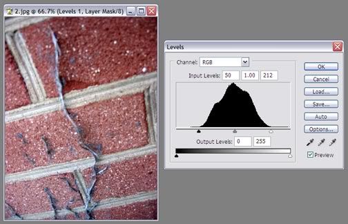
1. First off, open up the layers pallette (Layer > New Adjustment Layer > Levels). You'll get this window. For this image, I'm going to do the quick and dirty adjustment. Grab the white slider and pull it towards the middle, where the arch of the graph starts to appear. Then do the same thing with the black slider.
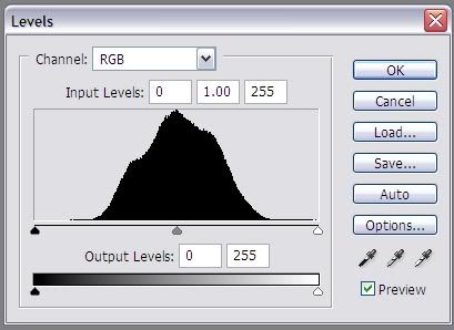
2. Now your image has proper white and black balance.
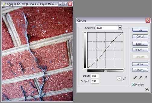
3. Next, open up the Curves pallette (Layer > New Adjustment Layer > Curves). That will bring up this window:
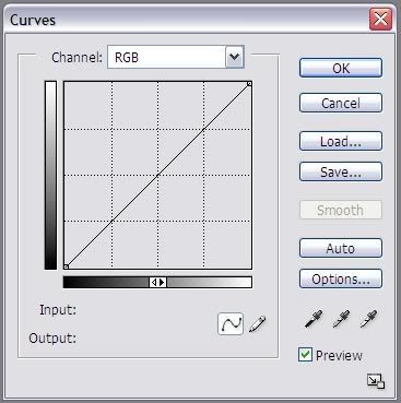
4. Set these 3 points. Your input/output should be 64/64, 128/128, and 191/191 from bottom left to top right.
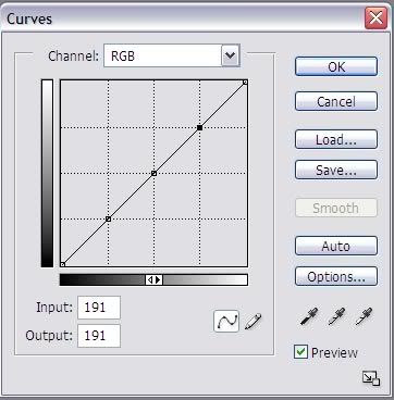
5. Next, move the bottom point down a tiny bit and the top point up a tiny bit to create an S curve like such:
Don't overdo it. A little contrast is nice, but if you get it too "hot" it can display and print weird. Actually, I've probably got too much on this, but you can turn the opacity of the curves layer down. (Window > Layers or F7)
6. Time for effects! Go to Layer > New Adjustment Layer > Hue/Saturation.
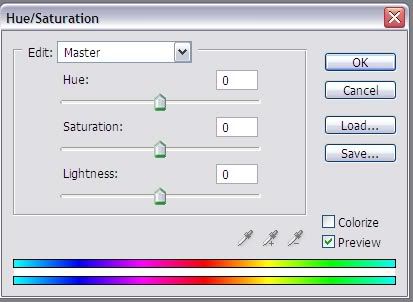
For black and white, simply pull the saturation slider all the way to the left:
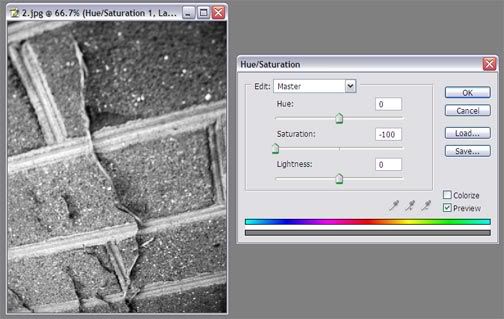
Black and white images can handle a little bit more contrast than color images.
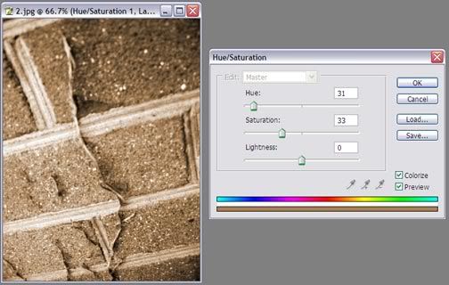
For sepia, check the little box that says "Colorize". To make it easier, I like to bring the saturation slider back to the middle at first. Then move the hue slider until the image turns orange (around 30). Last, take the saturation back down to about 33.
There it is! To invert images in Photoshop, go to Image > Adjustments > Invert, or Ctrl + I.
Original Image
1. First off, open up the layers pallette (Layer > New Adjustment Layer > Levels). You'll get this window. For this image, I'm going to do the quick and dirty adjustment. Grab the white slider and pull it towards the middle, where the arch of the graph starts to appear. Then do the same thing with the black slider.
2. Now your image has proper white and black balance.
3. Next, open up the Curves pallette (Layer > New Adjustment Layer > Curves). That will bring up this window:
4. Set these 3 points. Your input/output should be 64/64, 128/128, and 191/191 from bottom left to top right.
5. Next, move the bottom point down a tiny bit and the top point up a tiny bit to create an S curve like such:
Don't overdo it. A little contrast is nice, but if you get it too "hot" it can display and print weird. Actually, I've probably got too much on this, but you can turn the opacity of the curves layer down. (Window > Layers or F7)
6. Time for effects! Go to Layer > New Adjustment Layer > Hue/Saturation.
For black and white, simply pull the saturation slider all the way to the left:
Black and white images can handle a little bit more contrast than color images.
For sepia, check the little box that says "Colorize". To make it easier, I like to bring the saturation slider back to the middle at first. Then move the hue slider until the image turns orange (around 30). Last, take the saturation back down to about 33.
There it is! To invert images in Photoshop, go to Image > Adjustments > Invert, or Ctrl + I.
Who is online
Users browsing this forum: No registered users and 42 guests