Page 1 of 1
Sketch Lenny!
Posted: 12 Apr 2006 12:15 am
by ICKessler
All poses
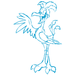
A loverly sketch lenny, all sketchy and stuff! A nice addition to the non-redraw colors for lennies. Not too dark, not too light. A little blocking in and scritchy-scratchyness. I wish it had a little more 'handmade' feel to it rather than being an exact copy of a standard lenny, but it's better than say, the sketch tuskaninny.
Posted: 12 Apr 2006 12:35 am
by Marah
It looks ...small. But it's okay, lennies are always okay! (Lennylove)
And for a sketch pet, it certainly isn't bad.
Posted: 12 Apr 2006 12:43 am
by Kidnemo
I agree with Kess, it's pretty but not especially sketchy.
Posted: 12 Apr 2006 01:04 am
by chocolatefairy13
I'm sure you guys know what I think...
*points to Outliner's Sketch club*

Posted: 12 Apr 2006 01:16 am
by Saturn
I really like how they interpreted the... action lines/motion effect/whatever on the hit pose. That's pretty neat. And it's a good thing they used darker lines than Sketch pets normally have, otherwise this would've been pretty hard to see considering how small the pet itself is compared to most other species.
Posted: 12 Apr 2006 01:49 am
by zebru
I don't like circle, happy and angry pose - it looks like the outline is broken and thined out on some places (head mostly) - You could say it's apropriate for sketch colour, but it feels a bit sloppy... I do understand it was hard to use thicker lines on such a small detailed face, so there you go.
Hit and sad pose are gorgeously done though

Posted: 12 Apr 2006 02:21 am
by Joey
Wow.
It's the neopet of my dreams o_o
Posted: 12 Apr 2006 05:31 am
by Guest
*agrees with the non sketchyness of it*
Anyway, I don't know about you guys but when I draw/sketch something I never have those guide lines that supposedly help with depth that you end up having to erase in the end.
Posted: 12 Apr 2006 06:00 am
by FaeMcCloud
Looks a bit closer to blue lineart than anything else ^^; But that's okay...*feels like coloring it*
Fae
Posted: 12 Apr 2006 07:01 am
by Akjara
Hm, is it just me or do the wings look strange somehow? Perhaps because there's no pattern on them, they look mostly aweful flat, especially on the attack poses.
Aside from that: Well, I like the Lenny for its colours not for its form. *g*
Posted: 12 Apr 2006 09:10 am
by Spivsy
it looks...zoomed out. Pixelly like. Sure, I like it, but it's tiny 0_o
Posted: 12 Apr 2006 12:23 pm
by Jazzy
They do help with depth, Vixie; they're also used for placement of features evenly.
Posted: 12 Apr 2006 04:33 pm
by zebru
Spivsy wrote:it looks...zoomed out. Pixelly like. Sure, I like it, but it's tiny 0_o
I think they drew him in much bigger size to squeeze in all details than resized it to it's tiny size - that explains why it looks a bit shabby
Posted: 12 Apr 2006 09:47 pm
by DamionDarkheart
It looks...rougher than a normal lenny, but more importantly, it just works and I rather like it.
Posted: 13 Apr 2006 11:44 pm
by covetiveness
Well, I've never been fond of sketch pets, but the sketch lenny is okay. I love the hit poses, but the circle pose looks too cartoon-like to me.