Rah wrote:
Personally, this is my favourite line art for pets. I think the glacier Darko was maybe a little too thin, but this one is perfect as far as lineart goes in my eyes
I like that kind of lineart. It's finesse to me.
Either the lines are too large for me (Glacier Ghostly) or too small (Spectrum and Glacier Darkonites). It's a fine middle-ground for me.
Last edited by Iggy on 11 Sep 2007 04:54 pm, edited 1 time in total.
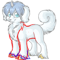
I was never a huge fan of the Malticorn and if this revamp goes through as is I will be even less of a fan. I'll start at the bottom and work my way up. The hooves are bad. Just bad. They are shaped oddly and they give the impression that they aren't really attached correctly. That brings me to the ankles which do in fact look broken with that stiff legged stance. The front and back legs look way too stiff and straight. The minute bend in the back leg doesn't really help, but seems to emphasize the utter stiffness. The tail is okay, but needs to taper a bit more close to the butt IMO. The chest fur is overdone and way too fluffy...it looks like a fur vest on top of the actual animal. The smile in the old one looked more like a smile just looks dopey. The eye shape is nice, but I agree that it lost a lot of personality by not looking up anymore. And last but not least...why is the horn curved now? It just does not look right at all. It looks like a claw sticking out of its head instead of a horn. Overall I am thoroughly unimpressed. Yes, the line art is better and the actual art is a step up, but the Malticorn lost whatever personality it had in this proposed revamp and I find that sad.
Oh okay then, Rah, I get it, I thought it was changed to be changed, but since it has a purpose..
Though, in that case, it needs a fluffier chest, and that black line on the chest, to be thinned out and look more hair like, or removed. .^_^;..because right now my eyes keep moving to it
Another thing, apparently the legs have been drawn to have equine anatomy now (not sure if they were before!) - I like the back legs more than the front though, I think. The hooves don't bother me - I'm not looking to compare them to real life cloven hooves. They're a whole different type of hoof to me and look fine :p
(Lol, on the eye subject, you might notice a lot of MY pets are looking up. They're not supposed to be though. I have trouble drawing pets looking at you xD Andi has had me redraw the eyes of my pets multiple times sometimes to get them to look at you! (eg, i thought the old angelic terracoon was looking at me))
I've always liked Malticorn's but something about them just bugged me. Not entirely sure what- maybe just the general cartoonish of it. That and the outline which I think is way too thick.
But the new one- love it. I like how fluffy it looks and the expression. Surprised that I like the eyes though, as normally I don't go for the 'big, cute eyes' look. Might just be the colour that helps- that's a lovely shade of blue.
I will agree that the hooves look very strange, though in all honesty I probably wouldn't have noticed them on my own.
Last edited by Alecko on 11 Sep 2007 05:05 pm, edited 1 time in total.
Okay, so..I redlined.. Probably gonna be hated forever for it, but..
That..its only a teensy little redline, on the front legs, giving them an ankle, and all.
Rah:..yea, its that you have to draw the pet looking at YOU, and make it look good, thats probably the hard part., but youve done very good with the pets youve done looking at the viewer Especially with some of the colors, like bloodred.. :O BLOODTHIRSTY PET, looking at you.
Jag does the Darkonites? I thought a different artist did those..? xD
Anyways.
The lineart for this pet is excellent; not to thick and not too thin.
I don't know why people are complaining of the stiffness of the legs, because I don't see it. The ankles don't look broken to me because I always thought Malticorns had extremely short fetlocks, which is hidden in those feathery feet. I think it's fairly anatomically correct.
The only thing I don't like personally is the face. It's become a lot more puppy-ish- almost chibi like in expression. I would have liked a more elegant, sophisticated-looking malticorn much better.
But this is still nice. I only hope the chibi doesn't change too much, if they're revamping everything.
I loved the old one and had a common one for a whille before turning Jeyska Reborn. The new one is loads better art wise, but parts of it do seem off.
I really don't like the new straight (and rather stiff) legs. The body itself is very boxy, and the neck is too straight. If I had to hold my head up that high and straight, I'd be rather uncomfortable. As someone mentioned earlier, the tail really does need to taper off more where it attaches to the body, it's weird having the same thickness when the old one was narrower at the base. It could use a few more fluffy spots at the tip of the curl as well I think. And last but not least, the muzzle is a lot narrower then the old Malticorn's was. The long narrow muzzle doesn't suit this pet at all.
For all the crits, the artist did do a good job on the revamp. I just hope Reborn isn't changed, though like Tiel said, its pretty close to this new version too so I shouldn't have too much to fear.
I believe few words can explain how I feel about this revamp. It doesn't look like a horse or anything equine for that matter, it looks plainly as a dog with hooves. It's sickening.
at first i liked it - but then i realised that it looked like a stacked dog in a showring. that is, that the front legs are very stiff and under the body. it almost looks like it's leaning forwards over its front legs. if they could make it look a little more relaxed, i think it'd look a lot better.
Oh, wah. D: I was looking forward to a Malticorn revamp. My Milinka used to be a Lilac Malticorn but I ended up changing her to a Spectrum Demi because the dull, common pose lilac art made me emo. But besides that I still loved the Malticorns because they were so cute.
): Man, I really want to like the new one but it just feels so off. The face is bothering me the most, I think. The ears feel too big and the face feels too small. ;_; And I don't like that it's looking at me. I feel like it totally lost it's personality. Before the pet seemed all "Aww, wook at me I is so ky00t" now It feels like the pet's all "*STARES AT YOU* I will eat your soul WHILE YOU SLEEP"
Rajface wrote:I would have liked a more elegant, sophisticated-looking malticorn much better.
That's what I was hoping from this revamp. It's meant to be part unicorn isn't it? I think a part-Unicorn pet should have elegance and sophistication so I am quite disappointed with this Chibi-Puppy sort of look it has right now.
Things I hope are amended:
-The horn. make it straighter, like a unicorn horn, not something toothlike.
-The hooves, the artist should look at the redlining Goldenchaos did
-The tail, make it less wide where it should attach.
-Remove the smile and replace with a more neutral expression.
Oh..well I wasn't sure what the "Malt" came from, but now that you mention it, I don't dislike it as much. I'd still like the few unicorn features it has left, the horn especially, to look right.