Well, if you hope to one day become an artist for the site, your lineart needs to be a little thicker. Especially on the Kerubi Beanie. On the HA version, it appears that your lines are gray, and Subeta's been pushing firmly for having black lineart.
I'm not an artist, so I can't offer much constructive crit, but I second the black, thicker lines thing, and I'll add that your pets need more shading. You'll also have to save them in gif format instead of jpg.
Last edited by Cranberry on 25 Dec 2007 08:35 am, edited 1 time in total.
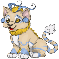
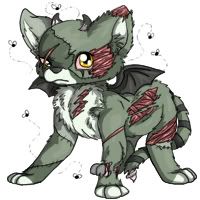
I like your art, but I thirdly agree with the thicker(slightly) and darker lines, Subeta has a strict rule of black lines, some great items were revamped to have black lines, the only expeptions are Angelic and Reborn pets (fire, wings + halo) I love the Feli the most, would definitely considered owning one if playing, a much greater improvement on the old feli, and keeping it still quite alike so not many complains, it also has the darkest lines out of your art that's why it sticks out.
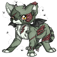
This one looks like it has most effor put into it, I think your work on this Feli is outstanding, the cuts and gashes are quite lifelike and gory, even the flies are cool.
thank you for your crits! I will work on that! I didn't realize they favored black lines though XD and I edited the images! Do they look better now? I darkened the lines
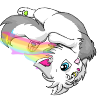
It makes me lol, therefore it's good. But artwise, it doesn't seem to have much of a rainbow on it's body and being upside down makes it really hard to tell what species it is.
I have to agree with others that the lineart is quite thin and could be worked on. I also second the 'more shading' comment, and also not to make the shading so hard-edged. I noticed on the chibi archans that some of the shading has hard points - and it's kind of not natural.
Although your art is pretty good, I'd also like to mention that some of the items look too big for the box size, and that some are even being cut off. You need to make sure you draw the items within the boarders with enough room between all the sides.
I also noticed (especially on the feli) that the head and some other proportions look squished or way too big, and the screen-right back leg on the feli looks really awkwardly placed. Just attention to little details like how big things are in proportion to others really helps make a great picture.
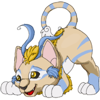
And I also agree with Huggles that the spectrum torrey you have made is very hard to recognize as a torry, and that it doesn't have nearly enough spectrum color on it. The bottom of the torrey's feet bothers me too - the leg should streamline into the bottom foot pad, and they way you have it drawn looks like the legs are backwards and we're seeing the top of the foot instead of the bottom. I think if you lose the little inward lines and ad a little heel line it would look a lot better.
ah thank you for the crits!Well with the torrey it wasn't intended to be that much turned, but I didn't fit it like I should have after I had finished it and I realized 'aaw crap I fudged that up' and tried to fix it. Somehow the items and pets always look too...small in my eyes for some reason. ;^^ and with the archan, I tried to use the same style of shading as with the original archan to make them look more alike. I don't normally shade like that
I love the cat bell and the detail on your graveyard feli. On the feli, it would be nice to see the muscle less random. Perhaps you could use a reference next time like maybe here. Still very nice though.
Your lineart on the spectrum torrey is much better and a lot more consistent. Very cute and imaginative pose too. It makes me think it's like a little rainbow super hero/heroin.
I really like the beanie, but my one complaint...well, everyone has beaten the thicker-lineart thing to death so I'm sure you can figure it out. c:
The Torrey definitely has an interesting pose, but I'm not sure if it'd work just because it's...well, so interesting. It's pretty cute, but I just don't see it as an official image because of it's strange pose. The comment about it looking like it's being punted, though..ahh, that really made me smile. Your art is so cute. c:
But! It's not just always cutesy. The graveyard pet is really nice, despite some anatomy things (already mentioned by others)...Those gashes show some really amazing realistic muscle work, and I just love how you made it more realistic-looking overall while still keeping the Subeta-like style.


